 Everyone knows the layout of a magazine cover. Specifically for fashion magazines, the covers usually feature a model or celebrity (the cover story), the magazines title, and headlines of other articles within the magazine. However, some fashion magazines take another approach to its covers, and only feature the cover story model or celebrity and the magazine’s name. How do the words on the magazine covers influence the reader?
In the classic case, we see the magazine as one just like the rest being sold. For fashion magazines, such as Elle, we will see who the cover story is on and we will be able to tell what articles are in the magazine, such as the best beauty tricks and the latest trends of the season. The only thing that sets this magazine apart from the rest is what the words actually say. They tell us what type of magazine it is. The give us a clue to what’s inside, and from there, we can determine if we wish to buy the magazine or not.
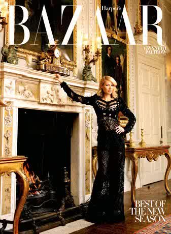
In the second case I mentioned, the magazine lacks the words that classic magazines have. There is only the magazine’s name, and maybe a headline about the cover story. Take this Harper’s Bazaar, for example. Here, we see Gwyneth Paltrow, the words “Harper’s Bazaar,” and a small headline about the new season. To me, though there is a lack of words, I am more enticed by this cover than by the Elle cover. This cover gives me mystery and gives off the impression that this issue must be a special edition, since it does not follow the classic magazine format. What little words it has on the cover, makes me want to read it more.
What does this say about words and images on magazine covers? More is not necessarily better. Sure, the more the magazine tells you what its articles about, the more you may find the magazine interesting and similar to your interests. But the lack of words gives off a different intrigue that also brings the reader in. Following my other blog posts, it seems to me that in this case, less is better. So what do you think, is less better?
Photo credit: Elle, Harper's Bazaar
No comments:
Post a Comment