Monday, November 29, 2010

Let's Go Aggies!

Colors can affect and transform a single design into a whole different meaning. Take the U.C. Davis colors - blue and gold (or specifically, UC Davis Blue 295 and UC Davis Gold 132). As a U.C. Davis student, when I see the colors blue and gold, I associate it with my school. Drawing from a sense of school pride, I am reminded of U.C. Davis every time I see this color combination, even if I do not see a U.C. Davis logo itself.

I feel that U.C. Davis’ school colors are more representative of the school than the design is. If we are giving a colorless (or just black and white) logo, we would only be reminded of the school if we saw the design. Instead, seeing the logo colored in blue and gold, we can be reminded of the school both if we see the logo and if we see only the colors associated with the logo.
Furthermore, if the logo was colored with different colors, say, red and white, blue and gold would no longer remind us of U.C. Davis. Rather, red and white would. Thus, we can see how colors transform the U.C. Davis logo into a different meaning. Colors personalize the logo to make it ours. Without them, it would be difficult to truly represent U.C. Davis in any other way. We can’t just go around showing school pride by dressing up as cows all the time!

Like Marco Boschini said, “Without color, il disegno may be called a body without a soul.” Similarly, without color, the U.C. Davis logo is a body without a soul. Colors give the logo dimension and character. We are blue and gold!

Click here for the official U.C. Davis colors for print and web, including branding colors, secondary colors, and traditional colors!

Skype with me!

Webcams are an invention that have improved relationships between people and help foster communication where none was available before. With webcams almost always included in laptop computers now, its design is convenient and makes to improve society. Of course, there are negative consequences that come with webcams, such as explicit and inappropriate content spread across the internet, but I believe the design of webcams really aim to make society better.

As most people own laptops nowadays, webcams no longer need to be purchased separately and are usually included with the computer. This makes webcamming between two people very easy and accessible through programs such as Skype. Because of this, communication between people has improved, especially for those relationships that are not local, but are across the country or even across the world. Before webcams, these relationships would need to survive through snail mail or telephone calls, which can end up costing a lot. Now, people can save money talking to their loved ones and have the joy of seeing each other’s faces at the same time!

Webcams, especially when installed into the computer itself, offers a stronger link between two people and allows for distance to go a little less noticed. Separation anxieties become a lesser problem within a relationship and communication between two people increases. The convenience of turning on your computer to the face of your loved one improves our society by allowing us to keep the connections that we have made in person. No longer are relationships lost due to lack of communication. Webcams have saved us from this and allow for the saying “keeping in touch” to really stay true! So, will you Skype with me? J

What would Audrey do?

Though we may not be aware of it at first, the cigarette holder, a fashion accessory of the early 1900s, is an object whose design is dangerous to society. Looking at old pictures of inspirational women of the early 20th century, like this famous one of Audrey Hepburn from Breakfast at Tiffany’s, we can see how the cigarette holder exudes glamour and elegance.

Consequently, many women flocked towards having cigarette holders so they, too, could look glamorous and elegant.

However, the promotion of the cigarette holder as glamorous only promotesdsmoking (which, of course, is bad for your health)! Sure, its slender body, its ability to filter, and keep your fingers from being dirty and ashy is appealing, but what about your health? Are the benefits of glamour greater than your life?

The simple, slender design of the cigarette holder made it glamorous and part of the upper class, and promoted the idea of the glamour in smoking, as well. Though the design was not intentionally created to promote the unhealthy habit of smoking, the connotations it suggested made the cigarette holder an indirect danger to society. More and more women started smoking because they thought it made them seem part of a higher society.

This brings to question the larger picture of how design can truly affect a larger society. The glamour of the cigarette holder overruled the effects smoking had on women’s health. As the dangers of smoking is still not stressed enough even in today’s society, the idea that smoking was bad did not affect women’s view of the prestigious cigarette holder. Thus, we see that social responsibility did not play a role in the creation and promotion of the cigarette holder and the ethics of women’s health was not considered. Prestige took precedence over long-term health. Though its danger is subtle, the design of the cigarette holder was detrimental to women’s health during the early 20th century.

What designs today show similar affects as the cigarette holder? Are there objects whose negative effects we ignore because we’d rather look cool?

Monday, November 15, 2010

Yarn Bombing

I stumbled on the concept of yarn bombing on the Free People Blog. I was attracted to the colorful yarn on every day, permanent objects, such as cars and telephone booths. The yarn adds a sense of free spirit to these objects that may not get a second glance if they were standing alone. The yarn also creates a sense of fantasy with these objects because they transform the object into something playful that looks like it belongs in another world. I feel as if these objects belong in a game of Candyland or Willie Wonka’s Chocolate Factory. There is a sense of happiness that springs from these objects that have been “yarn bombed.”

The designs and colors of the knitted yarn are what add to the yarn bombing experiences. Since the colors are bright, it catches the eye automatically. Just like if a car was painted bright pink, the colored yarn is something we don’t usually see, so we notice it more. The designs of the knitted yarn gives the objects texture, literally through the texture of the yarn, as well as the changing patterns which catch the fleeting eye, so it is not focused on just one spot.

I really like the concept of yarn bombing because it gives a modern, innocent twist to concrete objects, many which do not have much personality to start with. Yarn bombing is a great example of how one design can affect another in a creative and imaginative way. As is an underlying theme of this blog, design is everywhere, and we can even find design within a design to create a unique, eye-catching experience for those around us.


** All images taken from the Free People Blog.

The Ergonomics of a Beloved Backpack

As students, backpacks are something that most of us use every day. As a bag that holds our daily essentials, it is important that the design of our backpacks allows us to carry and access our things in the easiest, most efficient way. Many backpacks do this, while many others do not (where aesthetics take more precedence over functionality). Let’s take a look at the backpack I use every day – the Borealis by The North Face – using the Five Areas of Ergonomics Research.

1. Safety: Safety is a very important aspect of a product. Above all else, the user must be safe in using the product to even use it at all. In turn, safe product will lead to its continued use. Specifically concerning backpacks, safety concerns include lack of support, which can harm the shoulders or back if the backpack is too heavy. So far, my backpack has not had any problems regarding safety. I have had this backpack for over three years, and I have not had any back or shoulder problems regardless of the weight of my backpack.

2. Comfort: The user of a product definitely values the comfort of the product. If a product is not comfortable in use, then the user will not enjoy the using that product. Backpacks must be comfortable enough for the user to wear all day if needed. No one wants to feel the burden of items you are carrying. We want to be one with our backpack. Luckily for me, I feel at one with my Borealis. There is a cushion on the back of the backpack (the part that touches your back) to ensure that it rests nicely on the back and the contents of the backpack do not put pressure on the back. Also, the straps make sure that it sits at the right area of the back, not too high and not too low.

3. Ease of use: If a product is difficult to use, it will become a hassle rather than something for your benefit. A backpack should be designed to easily open and close to grab things from it quickly. It should also be able to be easily taken on and off. Lastly, the inside of the backpack should allow its contents to fit together nicely, so they are easy to find and put back. My backpack does all of the above and is very easy to use. It has many different compartments inside to organize all my laptop, books, and pens. I can easily take off my backpack, open it, grab a book, close it, and put it back on in a matter of seconds!

4. Performance: Performance is important as it is often the sole reason for a product’s invention. Thus, as long as a backpack can hold its items successfully, it has good performance. My Borealis has very good performance and I am always guaranteed that it will hold whatever I give it. It is sturdy and nothing has ever broken off of my backpack. Whereas many backpacks wear down on the bottom or their straps break after continual use, my backpack looks just like it did when I first got it!

5. Aesthetics: Although aesthetics is not directly important to a products performance and use, it is an important factor to the user to describe who he or she is and how the user feels when he or she uses the product. Personally, I would not want to carry a backpack I didn’t think look good. Since I am using my backpack practically every day, I identify it as an accessory to me outfit. This is why I chose my black Borealis backpack. I was initially attracted to how it looked and had been on the search for a backpack like it for years. Finally I discovered the Borealis and I fell in love. It’s not too flashy and does not look bulky. It is sleek and slender even when there are a lot of books in it.

When looking at a product, you want to make sure that it checks out with these five areas of ergonomics research. Doing so will ensure you have a great quality product that you will be happy with! Doing so with my Borealis backpack, I can contently say that I have never been happier with any other backpack than this one.

Monday, November 8, 2010

Word & Image: Magazines

Everyone knows the layout of a magazine cover. Specifically for fashion magazines, the covers usually feature a model or celebrity (the cover story), the magazines title, and headlines of other articles within the magazine. However, some fashion magazines take another approach to its covers, and only feature the cover story model or celebrity and the magazine’s name. How do the words on the magazine covers influence the reader?

In the classic case, we see the magazine as one just like the rest being sold. For fashion magazines, such as Elle, we will see who the cover story is on and we will be able to tell what articles are in the magazine, such as the best beauty tricks and the latest trends of the season. The only thing that sets this magazine apart from the rest is what the words actually say. They tell us what type of magazine it is. The give us a clue to what’s inside, and from there, we can determine if we wish to buy the magazine or not.
In the second case I mentioned, the magazine lacks the words that classic magazines have. There is only the magazine’s name, and maybe a headline about the cover story. Take this Harper’s Bazaar, for example. Here, we see Gwyneth Paltrow, the words “Harper’s Bazaar,” and a small headline about the new season. To me, though there is a lack of words, I am more enticed by this cover than by the Elle cover. This cover gives me mystery and gives off the impression that this issue must be a special edition, since it does not follow the classic magazine format. What little words it has on the cover, makes me want to read it more.

What does this say about words and images on magazine covers? More is not necessarily better. Sure, the more the magazine tells you what its articles about, the more you may find the magazine interesting and similar to your interests. But the lack of words gives off a different intrigue that also brings the reader in. Following my other blog posts, it seems to me that in this case, less is better. So what do you think, is less better?

Photo credit: Elle, Harper's Bazaar

Typography's Place in a Message

The typography of a visible message is very important in the aesthetic of that message. What may seem a trivial aspect of the message itself, is what may be the determining factor in whether or not that message is received correctly. Simple typography may allow the receiver to focus in on just the message itself. In the mean time, something complex can either enhance the message by adding feeling and character to it, or confuse the message because the receiver will not know how to read it. Typography also adds to the feel of the message. A message can be bold, soft, innocent, scary, demanding – all because of the typography.

Once example of how typography affects the message is from the Save TXC campaign put on by Textiles and Clothing students beginning last year.

Due to the budget cuts, the Textiles and Clothing Department was under the decision to close. The Textiles & Clothing students, who love their major (and minors!) so much, decided to protest this decision, using everything in our power to campaign against it. Our message said exactly what needed to be said to entice people to learn more about this issue and state what the cause was.

The typography, however, is what I think really caught people’s eyes and really carried the message across. Because it was simple, linear, symmetrical, and balanced, the message was clear and easy to read. The “TXC” was a light blue color in contrast to the rest of the text, which made the department stand out and caught the receiver’s eye. The rest of the text was in the same font, with “CALIFORNIA” and “ECONOMY” filling their own lines. I believe this really caught people’s eyes because “California” and the “economy” were pressing issues at the time. The typography gave the message a sense of boldness and showed that our message was a clear statement – saving the Textiles and Clothing Department (TXC) will save California’s economy. In the end, we found that our message truly traveled across campus, and because of the typography, it was easy to recognize and acknowledge. Anything more complicated would have ruined the message.

Note: Save TXC logo is auther's own.

Word & Image: Hand-Lettered Maps

Words and images are often used in conjunction with one another to convey a certain message or meaning. However, words can also be used in a way that does not create a meaning, but rather an image itself. When surfing the internet, I stumbled across some hand-lettered maps that were maps of various urban areas that showed names of districts in their respective areas.


I was really attracted to these hand-lettered maps because they were a form of map visually differently than any other I had ever seen. It functions the same as a “normal” map, in that it lists the various districts of the area. Yet, these hand-lettered maps really allow you to look at each area in order to read the various districts. Also, this map becomes more of a piece of art rather than a map for use.


What I love about the design of hand-lettered maps is their use of space. Each word is cleverly and strategically placed in a way that correctly represents its district, while not leaving any open space. Though it may or may not be proportionally accurate, this gives the map depth and complexity when looking at it. A simple color scheme allows us to focus on the words initially, and it is after we see the words together, in their entirety, do we realize it is a map. These aspects, though simple, are what makes these unique maps a piece of art and catches the eye.

New York hand-lettered map by Ursula Hitz
San Francisco hand-lettered map from unknown

Monday, November 1, 2010

Are Suits...Shameless?

Dutch label Suit Supply recently came out with its new “Shameless” ad campaign. These ads show various positions in which women are seen with the skirts and/or shirts open by its complementary male model. Obviously risqué, these ads are stirring controversy and have even been asked to be removed from Suit Supply’s Facebook page.


This ad campaign is a great example of how design may create a disconnect between a company’s message and what is actually perceived. In previous class lectures, we have learned of form and content within a design. Here, we see how an ad’s content can be misinterpreted by the public. Companies hire ad agencies to help convey a message to the public about their company. The ads are a means in which companies can attract new customers and create a new following. But when the content is misinterpreted and the company’s message is different than what is received by its audience, a company often looks to its ads as the point of disconnect.


Whether or not Suit Supply really meant for their ads to be so offensive, it is a fact that their “Shameless” ads are displeasing to the eye. We do not focus on the company when looking at the ad, but rather its content. And once interpreted, we develop a negative connection between the ad and the company it represents.

The lesson is clear: be careful with how you design your ad campaigns because it may lose more sales than boost them.

Industrial Design: the iPod

The iPod is an object that is mass-produced and consumed by many. The iPod is probably the most well-known and owned mp3 device among American citizens, and because of this, its design must be aesthetically pleasing to the eye and easy to use.

Everyone knows an iPod when they see one. The shape of a rectangle, we are attracted to its sleek and simple design. When looking at the classic iPod, black and silver are the only colors available. This adds to the simplicity of the design and is what, like most Apple products, initially attracts us to it. The color screen gives us a focus point on the iPod, obviously the part that we will gain the spotlight the most when we use our iPods. The screen is bright and calls out to its user. However, what we don’t notice is the touch pad underneath the screen, which offers a sense of subtle balance to the device. Without, it, the iPod would seem way too heavy on the top. We would feel an extra sense of emptiness when looking at our iPods.

The width of the iPod is not too thick and it is the perfect size to carry in your hand. This adds to its aesthetic and attractiveness. As the saying goes, “Sometimes less is better.” With the iPod, all that is needed in mass-consumption of an mp3 player is a rectangle, a circle, and a screen.

Objectified: Form and Content

In last Tuesday’s class, we watched the film Objectified. A main theme within this movie was the concept of form and content. In regards to design and the design of objects, form can be defined as the means in which an object was created. That is, its medium. Is something painted? Carved? Drawn? There are a multitude of mediums in which something can be created and a design can be executed. The content, then, is essentially what the form contains. It is the idea behind the whole design, and the concept that is meant to be conveyed. Looking at these two definitions, we see that form and content are interrelated. Without form, content is idle – it has no function within the world. Rather, it is merely an idea. Similarly, without content, form contains no meaning.

When we look at objects from a subjective perspective, we mostly recognize its form, and rarely its content. We see that something was painted, was carved, was drawn. But what does that form hold? Is there a function to the design? A reason why this particular form was used?

One example that I explicitly remember in Objectified that addressed this issue was the explanation of the Japanese toothpick. When we see the toothpick, we know that it’s wooden because we see its surface and texture, which is what we know to be wood. We know its primary function as a toothpick, as well, because our society implicitly tells us that it is used after we eat at restaurants. However, we usually do not recognize the divits at the top of the toothpick which also is designed to have a function. It is meant to be broken off at that point, so one can rest his or her toothpick on it. Yet, we do not think anything of this design beyond the surface of its look.

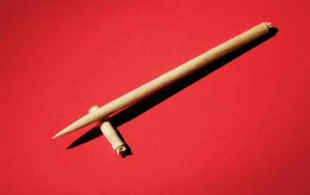
Thus, from this toothpick example, we see that all things are designed and have a function (its content), even though we may not pay attention to it (because we only pay attention to its form). We only see the wooden form of the toothpick, but neglect to see its content in its entirety. Consequently, we do not use the toothpick to its fullest potential. Form and content are interrelated and depend on each other to function and have a place in society. The toothpick depends on its wooden form to execute its use in the most efficient and resourceful way possible. Additionally, the wooden form is dependent on the idea of a toothpick as a tool to loosen food particles out of teeth to have a purpose in society. From this, we see that objects should not be objectified for they are more than just appearances and what is on the surface. They have content, like us, and purpose within the world.

Photo credit: Blog.BrianQuan.com

Monday, October 18, 2010

Compare/Contrast

On October 11, 2010, the new CoHo opened on the U.C. Davis campus. Under construction for almost two years, the new CoHo looks more modern and aesthetically appealing. Not knowing what the new Coho would look like while under construction, I was pleasantly surprised when I walked in on that Monday.

When I first encountered the CoHo when I was a freshman at UC Davis, I honestly didn’t think anything of it. Since I never needed to buy food or drinks there (thank you, DC!), I didn’t feel an urge to ever go. This changed my sophomore year, when I was on campus for longer parts of the day and needed some sustenance to keep me going throughout the day. However, I never actually liked spending time in the CoHo. It was just a place to go in, buy my food, and leave. It looked like a typical cafeteria area that every college had. It was a little old looking, but it served its purpose. The food counters and cashier stands were plain blocks with very little color to them. The tables and chairs were just standard chairs you would see on campus in a large room. Basically, nothing was very attractive at the CoHo.

After years of construction (or that’s what it seemed like to me), the CoHo finally opened and WOW. Compared to the old one, the design of the new CoHo has improved tenfold. It’s definitely a “happenin’” place to be and is always bustling with people. There are new booths that my roommate and I so fittingly call “comfy booths” because they look like just that – comfy! The new signs, counters, and cashier stands are a lot more colorful and inviting. The furniture looks a lot more appealing to sit in and makes you want to actually spend time in the CoHo. Each food counter has accents that make it unique and entices you to look at its menu. In my eyes, this new CoHo is modern, up-to-date, and a place UC Davis will definitely be showing off in the following years.

Design as a Conversation in Popular Culture Part 2: Street Art x TV

The Simpsons and Banksy are two well-known figures in today’s popular culture. The Simpsons is an animated television show that parodies the working-class American lifestyle. Banksy is a street artists known for his graffiti art that displays dark humor and his political activist’s views, particularly on British society. In this blog, I will examine another form of design as a conversation through a collaboration between Banksy and The Simpsons.

Posted above is a video of the famous introduction of The Simpsons, directed mainly by Banksy. As you probably have noticed, it is quite dark and not the usual satirical scene you see while watching The Simpsons introduction. This introduction, instead, is shown in the usual Banksy style, criticizing the fact that The Simpsons have been accused of outsourcing much of its animation and merchandising to a company in South Korea.

Here, it is obvious that Banksy’s message is about the mainstream program’s outsourcing to a lesser developed country. Here lies a conversation with his fans, The Simpsons’ audience, and America as a society. Aware of the fact that both he and The Simpsons have a large fanbase, I’m confident that he designed this introduction knowing that whatever message he sent out would have a large impact and would be seen by many. Thus, in Banksy style, he chose to design the intro as a criticism of the show, which is in fact, already a parody of the “American life.” We then have a criticism on top of a criticism, or a conversation within an existing conversation.

Like many artists, Banksy used his art to relay a message about American society on one of the most popular shows in the United States. This is a great example of how design can be used as a conversation, as Banksy tells the American people exactly what is wrong with their own society.

Wednesday, October 13, 2010

Design as a Conversation in Popular Culture Part 1: Music

In class last week, Professor Housefield showed us a video of Lady Gaga singing with Yoko Ono as a example of design as a conversation. This led me to think of music in general as a conversation. Many musical artists, from the Dixie Chicks to Nas, use their music as a medium for political and cultural discourse, or even as a conversation between rival artists. Just as many artists use their art to send a message to its audience, musical artists use their music to do the same.

The first topic I bring up is music as a medium for political and cultural discourse. Here, music as a conversation towards its audience can hold a lot of power within society. For example, rock and roll was once deemed as “music of the Devil” and many parents and adults did not want their kids to be influenced by rock and roll because they believed it would lead them to a life of violence and crime. The parents believed that the conversation between rock and roll artists and their audience would corrupt the innocent youth of their generation. This eventually led to stricter censorship guidelines and parental advisory labels on albums deemed too “explicit” for children under seventeen.

Another conversation held within music can be seen between “rival” artists, such as Nas and Jay-Z and Mariah Carey and Eminem. Here, conversations are held between artists as a means to “diss” the other, or bring the other down, while bringing your own reputation up. The feud between Nas and Jay-Z involved many internal and external factors, which ultimately helped in record sales for both artists due to this “conversation.” The rivalry between Mariah Carey and Eminem was a result between an alleged relationship and were the fuel to several songs between both artists. We see, here, that conversations between artists can be used to restore/destroy a reputation, increase record sales, and a means of publicity.

All in all, the conversation within music can involve a variety of factors and can also have multiple results. Music as a conversation, just like design as a conversation, has a larger affect on society and pop culture than one may realize. We see, then, how these conversations are pertinent in keeping the culture alive and allowing artists to voice their own opinions.

Monday, October 11, 2010

Hello Kitty

Words cannot express how infatuated I’ve been with Hello Kitty since the tender age of five. Sure, she may be a cultural phenomenon in the U.S. right now, but any true Hello Kitty fan would have known about her since their childhood. What made Hello Kitty so appealing to me as a child?

Founded in 1960, Sanrio Co., Ltd. created products featuring various animal characters inspired by the popularized segment of Japanese culture known as kawaii (cute). And that just what Hello Kitty and Co. was to me when I was five – cute. Their design gives the impression that they are fun-loving, huggable animals that live in their own fantasy world. They even have birthdays and personal life stories (FYI Keroppi shares the same birthday as me – July 10!). True, if I was introduced to them now, I would most likely think they were creepy, mouth-less animals. However, these Sanrio characters only remind me of my childhood.

The Sanrio characters have a simple design that matches the simpleness that is childhood. Their faces and bodies are basic shapes and have simple lines. Consequently, they give off the feeling of innocence. The colors of each character are bright and attractive to a young child’s eye. These factors combined create a sense of playfulness and easiness.

For the same reason that I find Hello Kitty and her friends appealing, the U.S. consumer market finds them appealing, as well. Hello Kitty has blown up in the last couple of years in popular culture and can be seen everywhere, from makeup to waffle makers. America loves the innocence that Hello Kitty portrays and her design is ubiquitous. The simple oval face with

rounded triangle ears, and a bow on one side is all that is needed to create a cultural phenomenon. As the saying goes, sometimes simple is better. In Hello Kitty’s case, being simple works in her favor.


Hello Kitty x M.A.C. Cosmetics

Creativity from Without

In class last week, we discussed the concept of “creativity from without.” One of the examples given was of a man, Andy Goldsworthy, who created ephemeral art from the nature around him. The specific piece that I remember was created from garlic leaves.

This concept of “creativity from without” lead me to think of other designers who have also found inspiration for their creativity from without. One designer’s work that I particularly remember encountering is Jay Sario, who created a dress for the Discarded to Divine Fashion Show in San Francisco in late April of this year.

Since the show was sponsored by Fiji Water, Jay Sario created a dress incorporating the company in order to be auctioned off for charity. A contestant on a past season of Project Runway, Jay Sario is a fashion designer that has had experience in creating garments inspired by various objects or ideas around him.

For this particular dress, he drew inspiration from the color and design on the plastic Fiji water bottle. He cut out circles from the bottle and connected them to the bottom of teal blue dress that he constructed. Without knowing about the concept, many would not notice that the circles at the bottom of his dress were made from Fiji water bottles.

Jay Sario was able to find inspiration in a plastic water bottle – an object that we overlook on a day to day basis. He created a beautiful garment from an object that we know so well to just hold water. He is a great example of how we can find inspiration and creativity outside of our own selves and even apply to our daily lives.

Stone Soup

Last Tuesday, my Design 1 group brought various materials to class in order to make our own version of “Stone Soup.”

Stone Soup, as we were reminded in class, is about three soldiers who, after their inability to find a home to eat at, decided to make their own meal - a soup. However, they did not have any ingredients to make this soup, so they asked each villager or family of villagers to make a small contribution in order for them to eat. Eventually, the villagers became eager to contribute to the soup in order to make it taste good. Each villager collaborated and worked together to create a delicious soup for the soldiers and everybody to eat. Applying this story to our class, Professor Housefield wanted us to make our own version of Stone Soup through working together and collaborating our ideas to create something “aesthetically appealing.”

Our supplies included construction paper, raffia, paint, rubber gloves, markers, a dictionary, water bottles cut into shapes, and other “ingredients” that could be added to our“soup.” At first, we were puzzled as to what to create, since we did not see an obvious way to bring all of our ingredients together. After brainstorming some ideas, we finally drew inspiration from one of our Christine’s shirt, which from KDVS with a green octopus on it.

Thus the creation process began! We decided the best way to construct our octopus was to make a head first and then the tentacles. We chose to use the raffia for the shape of a head and then each one of our members would contribute their own tentacle. Each member expressed their views of how we thought we could best construct the head. After much trial and error, we all decided that our octopus was less than aesthetically pleasing.

On to Plan B. We chose, instead, to make baby octopus from the rubber gloves and put in on the existing octopus. While some of us made the babies, the rest worked to compile a better octopus. Someone even threw in the idea of using the words “create” and “design” from the dictionary for others to interpret

what these words meant.

In the end, we created a something that everybody contributed to and were pleased with. Though it may not win the award for “Best Design,” we were successful in creating something that expressed everybody’s ideas and creativity towards a common goal. We learned to work together and because of this experience, we have become closer as a group and are not afraid to express our own thoughts and opinions with each other.

Monday, October 4, 2010

Let them eat cake.

A phrase most often used to address Marie Antoinette, who many blamed for the political turmoil in France in the 18th Century. Despite the politics, I absolutely adore 18th Century interior design and fashion. Coined the term, “Rococo,” it represents the lavish life and elegance of the French royalty.

What attracted me most to this type of design was the excessiveness that it entailed. Though this was a large part of the reason for the French’s failing economy, it was a necessity to the construction of the Rococo era. In modern terms, the mentality of the ruling class was, “Go hard or go home.” Thus, both the architecture and dress for the French royalty embodied a sense of luxury through intricate designs, volume, and excess. All architecture was accented in gold, intricate patterns were woven into fabrics used for upholstery and fashion, and the women wore gowns made from the best couturiers in Paris. The French royalty wanted to make a statement that they were the ruling class and how lavishly they could live. The excessiveness of this era was to ensure that the French royalty had absolutely the best and most expensive of everything.

Though I know what this era represents in terms of French politics, I still can’t help but admire the gilded architecture and beautifully structured gowns of this time. My love for 18th Century design was reaffirmed when I went to the Palace of Versailles during winter break of my junior year at Davis. Here, I truly saw how beautiful these designs were. What I fall short of in attempting to describe the miraculous designs of the Rococo era, I can show in some of the pictures I took on my trip:

This is Marie Antoinette's bedroom and one of my favorite rooms in the Palace. A perfect example of how excessive the Rococo era was. Here you can see how the patterns on the wall and curtains are almost too much for the eye to handle, in addition to the gold accents along the railing and lining the furniture and walls.

This is the Hall of Mirrors. Though hard to see in its entirety, the walls are lined with ceiling-to-floor mirrors and the hall itself is adorned with a multitude of chandeliers. Again, the walls are accented with gold, as well. The mirrors and chandeliers signify luxury and the amount that is used to decorate this room reaffirms royalty.


(Excuse the people in the picture...) The gold gates to enter the Palace is already a sign to the public that royalty lives here. The message: "This is a elegant and luxurious estate."

How did design first impact my life?

When we were asked to remember the first object that had a positive memory of the impact of design, I had trouble thinking of the things in my childhood that I actually noticed the design of. To me, I couldn’t think of the literal design of anything, but rather only the action of playing with or using certain objects. But then it dawned on me…L.A. GEAR LIGHT UP SHOES. How could I forget about something whose design was such a defining point of the era I grew up in?


A self-proclaimed shoe addict, of course I owned a pair of L.A. Gear shoes. Every kid had them or wanted them. But what about this shoe made it so coveted? The most defining part of its design is the “light up” sole. Different than any shoe, the lights catch your eye automatically. Every time someone wearing the shoe took a step, lights lit up the shoe. Whether or not this design was used as a gimmick to attract children to beg their parents to buy shoes that were L.A. Gear brand, it worked. The lights in the shoe honed in on every child’s attraction to bright, “shiny” objects. Thus, whoever had L.A. Gear light up shoes was the center of attention, as all eyes focused on the lucky one running away with lit up feet.

Furthermore, what made these shoes so acceptable among adults, was the fact that they were still sneakers. An important factor for parents, their children’s feet could still have support with these new shoes (unlike let’s say, Crocs, whose design may be comfortable, but not practical for children running around).

Most tennis shoes at the time looked the same to me, except for L.A. Gear light up shoes. The design of the shoe made this pair of sneakers a hot, standout item for me and as a result, a memorable part of my childhood. It’s hard to notice the design of something when you are young, but I can say for a fact that the design of these shoes are definitely the reason I remembered them.

Friday, October 1, 2010

The Spirit of the Times

In one of Professor Housefield's blog posts, he discusses the term "zeitgeist" and proposes the question, "Will we see cultural responses to echo the rise of disco and punk in that earlier decade (in reference to current designers' work reflecting the 1970s and its economic hardships)?"

This question prompted me to think of trends in fashion design. As mentioned in Professor Housefield’s blog, “Fashion perpetually resurrects ghosts from the past.” A known fact among fashion aficionados, fashion trends tend to “recycle” every twenty or so years. However, what does this mean and why does it happen?

One explanation I have come up with is that with each trend that recycles comes a new generation. So, the “zeitgeist” of one era can be resurrected and reproduced via the next generation. Designers of each generation draw inspiration from the last, changing and modifying their designs to modernize what has already been done. Take disco for example. The design of the platform shoe grew popularity during the 1970s. Concurrent with this trend and the trends seen at New York Fashion Week Spring Summer 2011, platform shoes are making a comeback.


[A red, glittered platform shoe from the '70s vs. A pair of gold, glittered shoes from Steve Madden]

We are constantly on a search for the new, but we are reliant on the past. However, as Walter Benjamin puts it, fashion is a "now time," and "eternal present." Thus, fashion defines time itself.

Yet, this poses another question. What really is the “spirit of the times” if fashion is always recycling? Fashion designs have always acted as physical evidence to trace part of a society’s past and culture. Yet, if fashion is always recycling, does that mean what we value in our society and what defines our generation is recycling, as well? A complicated question, with no right answer, I can only point out the intersectionalities design has with the rest of our life and why I think design is important. Design is everywhere and takes part in everything we do. It is connected with what we represent, who we try to be, what we value, and what we want to express.

"Fashion is not something that exists in dresses only. Fashion is in the sky, in the street, fashion has to do with ideas, the way we live, what is happening. " - Coco Chanel