Monday, November 29, 2010

Let's Go Aggies!

Colors can affect and transform a single design into a whole different meaning. Take the U.C. Davis colors - blue and gold (or specifically, UC Davis Blue 295 and UC Davis Gold 132). As a U.C. Davis student, when I see the colors blue and gold, I associate it with my school. Drawing from a sense of school pride, I am reminded of U.C. Davis every time I see this color combination, even if I do not see a U.C. Davis logo itself.

I feel that U.C. Davis’ school colors are more representative of the school than the design is. If we are giving a colorless (or just black and white) logo, we would only be reminded of the school if we saw the design. Instead, seeing the logo colored in blue and gold, we can be reminded of the school both if we see the logo and if we see only the colors associated with the logo.
Furthermore, if the logo was colored with different colors, say, red and white, blue and gold would no longer remind us of U.C. Davis. Rather, red and white would. Thus, we can see how colors transform the U.C. Davis logo into a different meaning. Colors personalize the logo to make it ours. Without them, it would be difficult to truly represent U.C. Davis in any other way. We can’t just go around showing school pride by dressing up as cows all the time!

Like Marco Boschini said, “Without color, il disegno may be called a body without a soul.” Similarly, without color, the U.C. Davis logo is a body without a soul. Colors give the logo dimension and character. We are blue and gold!

Click here for the official U.C. Davis colors for print and web, including branding colors, secondary colors, and traditional colors!

Skype with me!

Webcams are an invention that have improved relationships between people and help foster communication where none was available before. With webcams almost always included in laptop computers now, its design is convenient and makes to improve society. Of course, there are negative consequences that come with webcams, such as explicit and inappropriate content spread across the internet, but I believe the design of webcams really aim to make society better.

As most people own laptops nowadays, webcams no longer need to be purchased separately and are usually included with the computer. This makes webcamming between two people very easy and accessible through programs such as Skype. Because of this, communication between people has improved, especially for those relationships that are not local, but are across the country or even across the world. Before webcams, these relationships would need to survive through snail mail or telephone calls, which can end up costing a lot. Now, people can save money talking to their loved ones and have the joy of seeing each other’s faces at the same time!

Webcams, especially when installed into the computer itself, offers a stronger link between two people and allows for distance to go a little less noticed. Separation anxieties become a lesser problem within a relationship and communication between two people increases. The convenience of turning on your computer to the face of your loved one improves our society by allowing us to keep the connections that we have made in person. No longer are relationships lost due to lack of communication. Webcams have saved us from this and allow for the saying “keeping in touch” to really stay true! So, will you Skype with me? J

What would Audrey do?

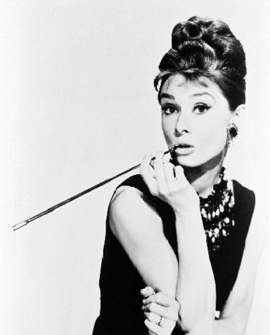
Though we may not be aware of it at first, the cigarette holder, a fashion accessory of the early 1900s, is an object whose design is dangerous to society. Looking at old pictures of inspirational women of the early 20th century, like this famous one of Audrey Hepburn from Breakfast at Tiffany’s, we can see how the cigarette holder exudes glamour and elegance.

Consequently, many women flocked towards having cigarette holders so they, too, could look glamorous and elegant.

However, the promotion of the cigarette holder as glamorous only promotesdsmoking (which, of course, is bad for your health)! Sure, its slender body, its ability to filter, and keep your fingers from being dirty and ashy is appealing, but what about your health? Are the benefits of glamour greater than your life?

The simple, slender design of the cigarette holder made it glamorous and part of the upper class, and promoted the idea of the glamour in smoking, as well. Though the design was not intentionally created to promote the unhealthy habit of smoking, the connotations it suggested made the cigarette holder an indirect danger to society. More and more women started smoking because they thought it made them seem part of a higher society.

This brings to question the larger picture of how design can truly affect a larger society. The glamour of the cigarette holder overruled the effects smoking had on women’s health. As the dangers of smoking is still not stressed enough even in today’s society, the idea that smoking was bad did not affect women’s view of the prestigious cigarette holder. Thus, we see that social responsibility did not play a role in the creation and promotion of the cigarette holder and the ethics of women’s health was not considered. Prestige took precedence over long-term health. Though its danger is subtle, the design of the cigarette holder was detrimental to women’s health during the early 20th century.

What designs today show similar affects as the cigarette holder? Are there objects whose negative effects we ignore because we’d rather look cool?

Monday, November 15, 2010

Yarn Bombing

I stumbled on the concept of yarn bombing on the Free People Blog. I was attracted to the colorful yarn on every day, permanent objects, such as cars and telephone booths. The yarn adds a sense of free spirit to these objects that may not get a second glance if they were standing alone. The yarn also creates a sense of fantasy with these objects because they transform the object into something playful that looks like it belongs in another world. I feel as if these objects belong in a game of Candyland or Willie Wonka’s Chocolate Factory. There is a sense of happiness that springs from these objects that have been “yarn bombed.”

The designs and colors of the knitted yarn are what add to the yarn bombing experiences. Since the colors are bright, it catches the eye automatically. Just like if a car was painted bright pink, the colored yarn is something we don’t usually see, so we notice it more. The designs of the knitted yarn gives the objects texture, literally through the texture of the yarn, as well as the changing patterns which catch the fleeting eye, so it is not focused on just one spot.

I really like the concept of yarn bombing because it gives a modern, innocent twist to concrete objects, many which do not have much personality to start with. Yarn bombing is a great example of how one design can affect another in a creative and imaginative way. As is an underlying theme of this blog, design is everywhere, and we can even find design within a design to create a unique, eye-catching experience for those around us.


** All images taken from the Free People Blog.

The Ergonomics of a Beloved Backpack

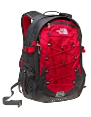
As students, backpacks are something that most of us use every day. As a bag that holds our daily essentials, it is important that the design of our backpacks allows us to carry and access our things in the easiest, most efficient way. Many backpacks do this, while many others do not (where aesthetics take more precedence over functionality). Let’s take a look at the backpack I use every day – the Borealis by The North Face – using the Five Areas of Ergonomics Research.

1. Safety: Safety is a very important aspect of a product. Above all else, the user must be safe in using the product to even use it at all. In turn, safe product will lead to its continued use. Specifically concerning backpacks, safety concerns include lack of support, which can harm the shoulders or back if the backpack is too heavy. So far, my backpack has not had any problems regarding safety. I have had this backpack for over three years, and I have not had any back or shoulder problems regardless of the weight of my backpack.

2. Comfort: The user of a product definitely values the comfort of the product. If a product is not comfortable in use, then the user will not enjoy the using that product. Backpacks must be comfortable enough for the user to wear all day if needed. No one wants to feel the burden of items you are carrying. We want to be one with our backpack. Luckily for me, I feel at one with my Borealis. There is a cushion on the back of the backpack (the part that touches your back) to ensure that it rests nicely on the back and the contents of the backpack do not put pressure on the back. Also, the straps make sure that it sits at the right area of the back, not too high and not too low.

3. Ease of use: If a product is difficult to use, it will become a hassle rather than something for your benefit. A backpack should be designed to easily open and close to grab things from it quickly. It should also be able to be easily taken on and off. Lastly, the inside of the backpack should allow its contents to fit together nicely, so they are easy to find and put back. My backpack does all of the above and is very easy to use. It has many different compartments inside to organize all my laptop, books, and pens. I can easily take off my backpack, open it, grab a book, close it, and put it back on in a matter of seconds!

4. Performance: Performance is important as it is often the sole reason for a product’s invention. Thus, as long as a backpack can hold its items successfully, it has good performance. My Borealis has very good performance and I am always guaranteed that it will hold whatever I give it. It is sturdy and nothing has ever broken off of my backpack. Whereas many backpacks wear down on the bottom or their straps break after continual use, my backpack looks just like it did when I first got it!

5. Aesthetics: Although aesthetics is not directly important to a products performance and use, it is an important factor to the user to describe who he or she is and how the user feels when he or she uses the product. Personally, I would not want to carry a backpack I didn’t think look good. Since I am using my backpack practically every day, I identify it as an accessory to me outfit. This is why I chose my black Borealis backpack. I was initially attracted to how it looked and had been on the search for a backpack like it for years. Finally I discovered the Borealis and I fell in love. It’s not too flashy and does not look bulky. It is sleek and slender even when there are a lot of books in it.

When looking at a product, you want to make sure that it checks out with these five areas of ergonomics research. Doing so will ensure you have a great quality product that you will be happy with! Doing so with my Borealis backpack, I can contently say that I have never been happier with any other backpack than this one.

Monday, November 8, 2010

Word & Image: Magazines

Everyone knows the layout of a magazine cover. Specifically for fashion magazines, the covers usually feature a model or celebrity (the cover story), the magazines title, and headlines of other articles within the magazine. However, some fashion magazines take another approach to its covers, and only feature the cover story model or celebrity and the magazine’s name. How do the words on the magazine covers influence the reader?

In the classic case, we see the magazine as one just like the rest being sold. For fashion magazines, such as Elle, we will see who the cover story is on and we will be able to tell what articles are in the magazine, such as the best beauty tricks and the latest trends of the season. The only thing that sets this magazine apart from the rest is what the words actually say. They tell us what type of magazine it is. The give us a clue to what’s inside, and from there, we can determine if we wish to buy the magazine or not.
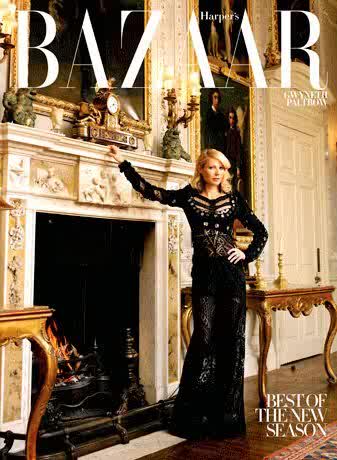
In the second case I mentioned, the magazine lacks the words that classic magazines have. There is only the magazine’s name, and maybe a headline about the cover story. Take this Harper’s Bazaar, for example. Here, we see Gwyneth Paltrow, the words “Harper’s Bazaar,” and a small headline about the new season. To me, though there is a lack of words, I am more enticed by this cover than by the Elle cover. This cover gives me mystery and gives off the impression that this issue must be a special edition, since it does not follow the classic magazine format. What little words it has on the cover, makes me want to read it more.

What does this say about words and images on magazine covers? More is not necessarily better. Sure, the more the magazine tells you what its articles about, the more you may find the magazine interesting and similar to your interests. But the lack of words gives off a different intrigue that also brings the reader in. Following my other blog posts, it seems to me that in this case, less is better. So what do you think, is less better?

Photo credit: Elle, Harper's Bazaar

Typography's Place in a Message

The typography of a visible message is very important in the aesthetic of that message. What may seem a trivial aspect of the message itself, is what may be the determining factor in whether or not that message is received correctly. Simple typography may allow the receiver to focus in on just the message itself. In the mean time, something complex can either enhance the message by adding feeling and character to it, or confuse the message because the receiver will not know how to read it. Typography also adds to the feel of the message. A message can be bold, soft, innocent, scary, demanding – all because of the typography.

Once example of how typography affects the message is from the Save TXC campaign put on by Textiles and Clothing students beginning last year.

Due to the budget cuts, the Textiles and Clothing Department was under the decision to close. The Textiles & Clothing students, who love their major (and minors!) so much, decided to protest this decision, using everything in our power to campaign against it. Our message said exactly what needed to be said to entice people to learn more about this issue and state what the cause was.

The typography, however, is what I think really caught people’s eyes and really carried the message across. Because it was simple, linear, symmetrical, and balanced, the message was clear and easy to read. The “TXC” was a light blue color in contrast to the rest of the text, which made the department stand out and caught the receiver’s eye. The rest of the text was in the same font, with “CALIFORNIA” and “ECONOMY” filling their own lines. I believe this really caught people’s eyes because “California” and the “economy” were pressing issues at the time. The typography gave the message a sense of boldness and showed that our message was a clear statement – saving the Textiles and Clothing Department (TXC) will save California’s economy. In the end, we found that our message truly traveled across campus, and because of the typography, it was easy to recognize and acknowledge. Anything more complicated would have ruined the message.

Note: Save TXC logo is auther's own.